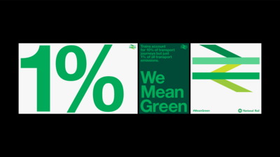
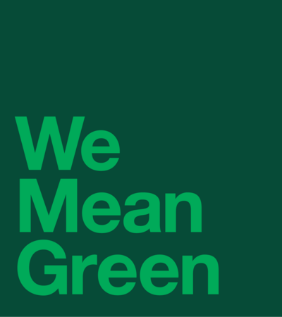
We Mean Green
- Transport
- Campaign
- Sustainability
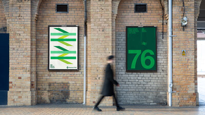
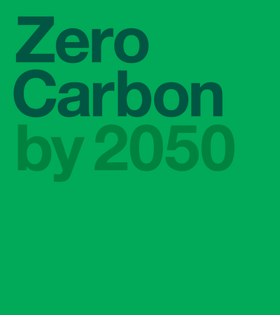
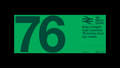
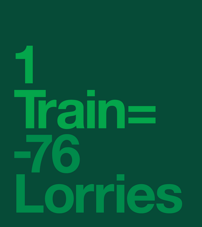
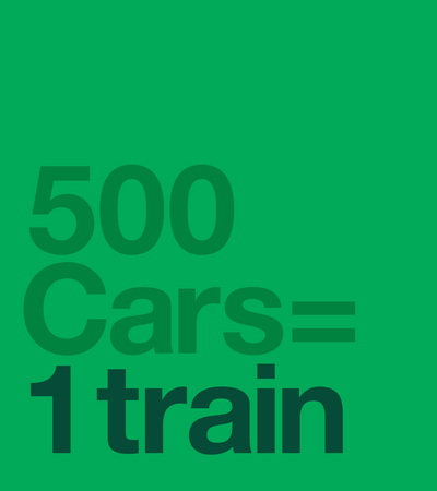
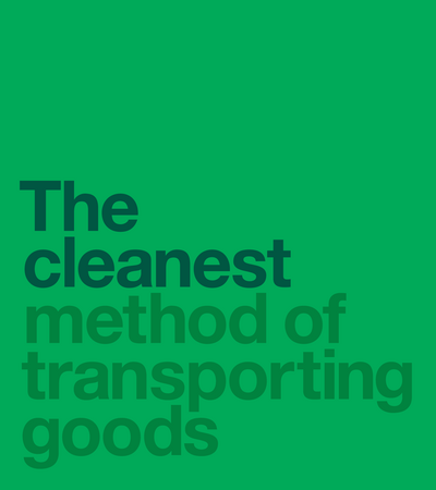
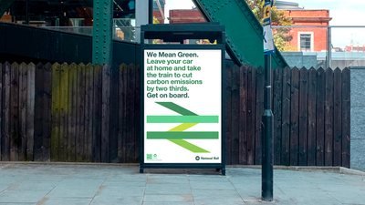
Studio Blackburn were asked to create a print and digital campaign to promote the environmental benefits of rail travel — for use at COP26. The campaign’s objective is to encourage a modal shift from road to rail.
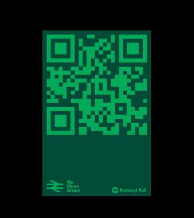
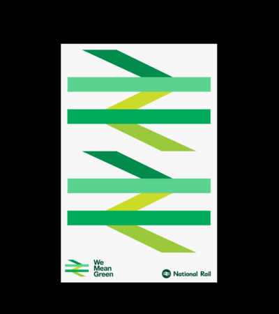
The eight week campaign uses a colour adaptation of the Britain Runs on Rail logotype — originally adapted from Gerald Barney’s 1965 double-arrow logo by M&C Saatchi. It simultaneously draws on the heritage and recognition of the past but — more importantly — draws attention to the environmental benefits of rail travel over other forms.