


The TrendBible rebrand needed to allow space to showcase the constantly shifting trends without visually clashing or competing with them.
Mark Jones
Design Director
Toggle

TrendBible
- Forecasting
- Brand Identity
- Packaging
- Web Design
Trend Bible is a global future trends agency, focused on identifying tomorrow’s opportunities.
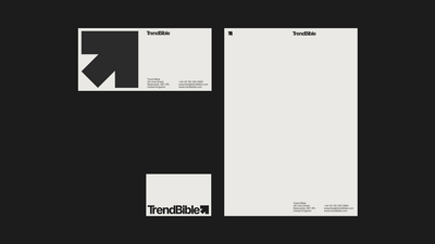
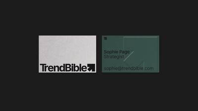
Studio Blackburn were tasked with creating a new visual identity to reflect the ambitions of the agency and to shape a brand profile for future growth.
The new identity needed to allow space to showcase the constantly shifting trends without visually clashing or competing with them. Our solution was an identity with no fixed colour palette, that can instead reflect seasonal colours. This sits alongside a forward looking bold graphic arrow symbol.
The new brand has successfully captured the company’s ambition and has been pivotal in equipping it for its next exciting phase of growth.