
Pinter
- Beer
- Brand Identity
- Website Design
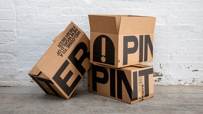
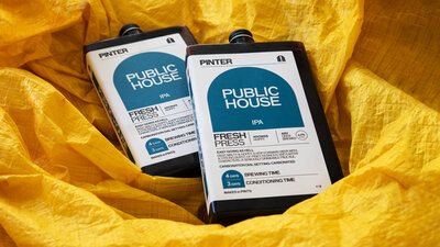
- Packaging
- Brand Strategy
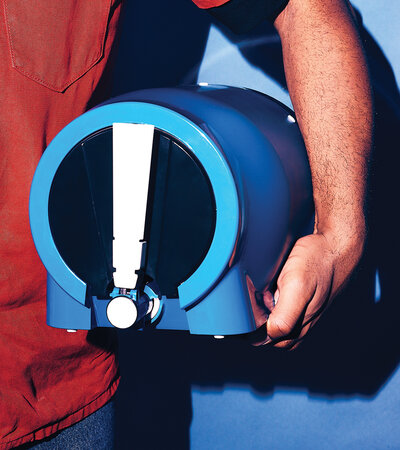
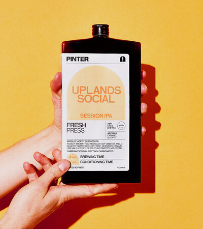
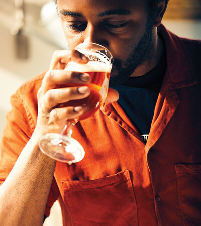
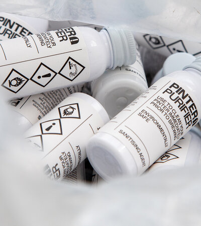
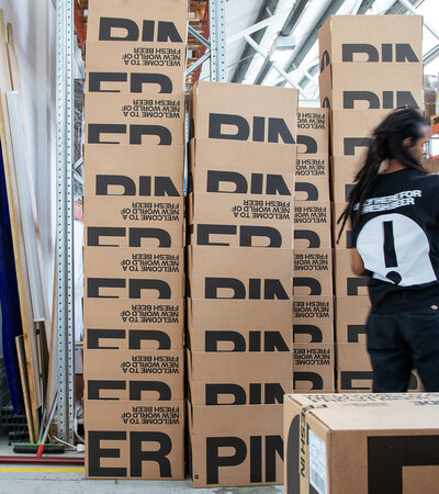
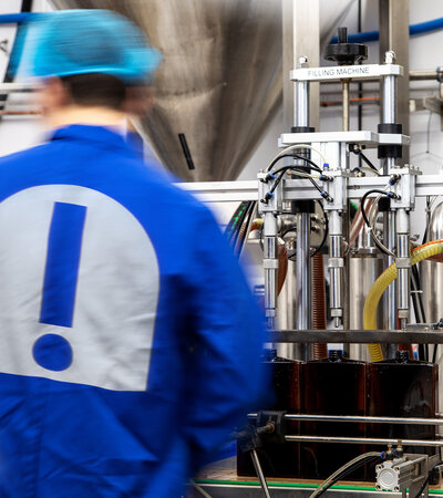
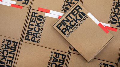
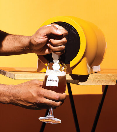
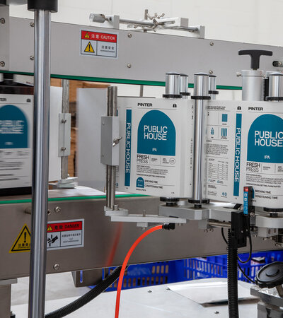
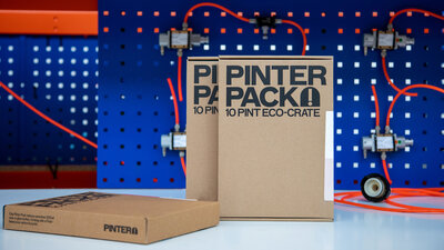
Pinter is a world-first innovation that allows you to brew 10 pints of fresh beer or cider. It’s affordable, sustainable and most importantly, tastes incredibly good.
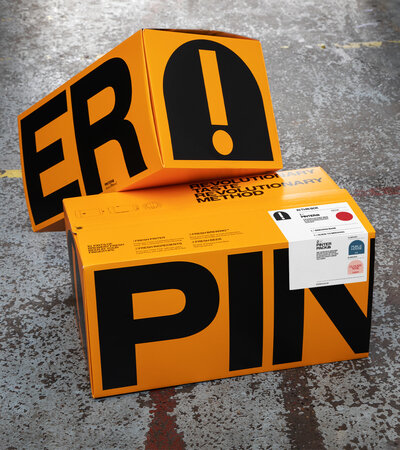
Studio Blackburn was tasked with creating an impactful brand identity reflective of the innovation and quality that the product delivers.
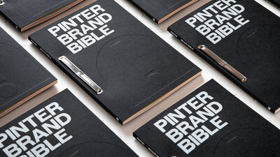
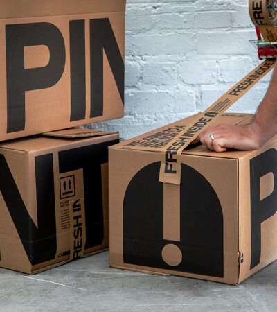
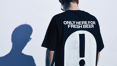
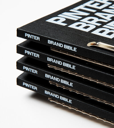
We delivered everything you’d expect from a branding project — logotype, typographic approach, colour palette (the OG’s) — and more, providing a completely refreshed strategy, look, feel, and attitude, which we brought together in a beautifully produced brand bible.
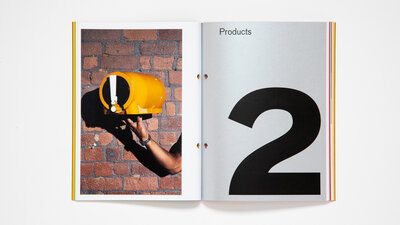
Pinter demand continues to outstrip supply, with the launch of Pinter 2 imminent.