A Smarter
North East
Blog — City of Sunderland
03.12.21
Studio Blackburn has recently unveiled a new brand for Sunderland, which aims to give the city a voice on a local, national and international scale and position it as a Smart City following the award of Smart City of the Year 2020.
The identity was informed by the city’s continued work towards encouraging digital transformation across communities and businesses and positions.
The Wordmark & System
At the core of the new brand is the City of Sunderland wordmark. Including “City of” was an important choice, Sunderland has had city status for the last 30 years and there aren’t always ample opportunities to celebrate that fact.
As well as acknowledging this, the “City of” logotype is also a useful graphic device, which can be used to highlight certain words.
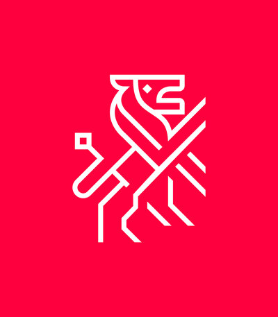
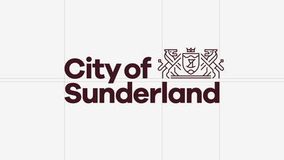
The Crest & Palette
While the wordmark can be used across all forms of communications, a redrawn city emblem is reserved for special occasions. It has been stylistically simplified so that it is easy to understand and can also be printed in just one colour.
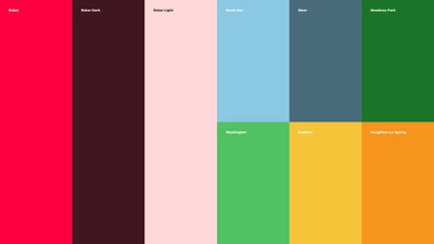
All of this is underpinned by a primary colour palette of reds which take inspiration from Sunderland Football Club and a secondary palette inspired by the city’s surrounding areas.

City of Smart
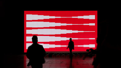
With the city’s continued work towards encouraging digital transformation in mind — Studio Blackburn were also tasked with creating a unique event to announce and celebrate this significant step forward for digital connected infrastructure across the city of Sunderland. The Sunderland City Council and BAI Communications partnership launch was held in Sunderland in October 2021 and was recieved rapturously, a testament to the collaborative process that Sunderland City Council pursue, and to the potential that a future-focussed organisation like BAI Communications can bring.
Links