10 Years of
Studio Blackburn
Blog — Studio Update
08.09.21
Ten years ago I set-up Studio Blackburn with various aims, one of which was to create a place where I could employ my favourite designers to do their best work.
My approach has been very much a hands off one with the people I’ve been fortunate enough to work with, guiding and shaping rather than prescribing or dictating. At this ten year juncture of Studio Blackburn we have decided to create a new identity and website built on the foundations of our first decade. After relatively informal briefing sessions, the team have been allowed to develop their own approach. I’ve enjoyed enormously watching the different personalities in the studio push things along. Each evening checking the slack channel to see where we’re at has felt like being a child opening presents at christmas.
It’s great to have played a part in the creation of something I could never have designed and produced on my own, certainly not this well anyway. I’m surprised at the choice of red for a ‘brand colour’, but I love it. It got me thinking about the colour red, not a colour I thought I naturally gravitate towards. But it seems that it has punctuated some significant moments in my life. Here’s ten of them.
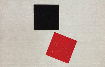
Red 01
The Square Red Studio
I was introduced to The Square Red Studio, run by Marcus Ainley and Tony Hutchinson, in 1994. I presumptiously based myself in their Kensal Green studio for the best part of a year, without so much as an invite (young people are so stupid!). It was a super environment to be in, Marcus and Tony were sources of inspiration, stories and cultural references. Initially trading as Red Square they took an early decision to rename to the rather less militant sounding The Square Red Studio. Says Marcus, “I liked it that way round — I loved all things French and in french it was Carre Rouge — so for me that clinched it!“ El Lissitzky’s ‘About Two Squares’ was also instrumental, “that was an early influence — I also then collected examples of Red squares whenever and wherever I spotted them — Frank Lloyd Wright signed his buildings with a square red tile by the front doors of his houses and his drawings too”.
Red 02
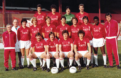
Supporting the Reds
People say that football’s boring,
Ronnie Glavin’s always scoring,
Can you hear the Ponty’s roaring,
Glavin is our King.
I’m stuck with Barnsley FC. My first visit to Barnsley’s ground, Oakwell, was around the time of my eighth birthday in 1977, a 3-2 home win against Hartlepool in the old fourth division. By 1980 we were up in the second division with Norman Hunter at the helm. The Barnsley kits of that era, like this plain Umbro one, will always hold a soft spot. Ronnie Glavin, my all-time favourite player, seated second from the right.
Red 03
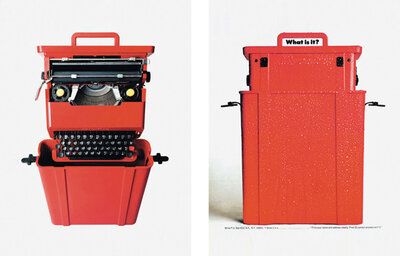
Sottsass
I first came across Memphis and Sottsass whilst studying design history at Barnsley College of Art and Design. It turns out that Sottsass liked red. In fact, the two items of his I covet most — the Olivetti Valentine typewriter and his pepper mill for Alessi are both predominantly red. And he was also of the South Tyrol, his architect father designed the town hall in Merano. One of the other three original founder members of Memphis — Matteo Thun — is not only from South Tyrol but in fact designed Hotel Vigilius as his first major architectural project.
Red 04
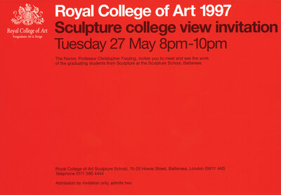
Brick
From 1994 to 1998 I ran a company with Malcolm Goldie. We called ourselves Brick. Still a great name. We didn’t get too far, and I’ve always looked back thinking that we were a bit of a shambles, but there were some nice pieces of work produced. When we won the competition to design the Royal College of Art 1997 end of year show catalogues and invitations, I don’t think either of us realised what a privilege it was. The invites were the standout items, printed in a suite of colours, this red one the pick of the bunch.
Red 05
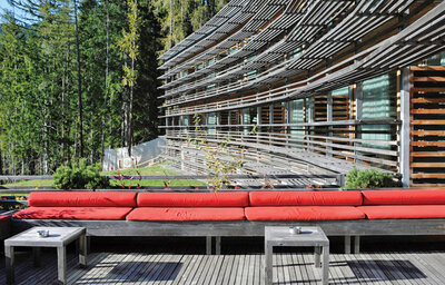
Being in the Südtirol
The South Tyrol is the best place in the world, end of. When I first visited it was to stay at Hotel Vigilius, perched at 1500m and accessible only via cable car. But I’d known of the area ever since a family holiday to Rimini as a child driven in my dad’s Triumph Dolomite. ‘Dolomiti’ — a mythical Alpine land of Italians speaking German and everything running on time. Modernist, natural, warm and hospitable all describe the South Tyrol, but Post-modernism and Memphis have roots here too. Lush green mountains and perfect blue skies are punctuated by the colour red, in the flag, coat of arms, the signage, it’s the reassuring highlight colour of South Tyrol.
Red 06
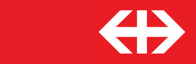
Swiss Railways
The SBB logotype and identity system is as hard as nails. The central vertical stroke of the logo anchors it and the arrows, left to right, create a modified Swiss flag within them. With Switzerland at the centre the arrows infer travel inside and beyond the region. The symbol is symmetrical and centred, but ranged right in a rectangular horizontal holding box giving the impression of the white symbol having moved from left to right within it. On the occasions I visit Switzerland the SBB logotype is the first thing I look for, a brand that should never be re-designed.
Red 07
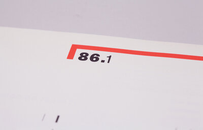
Knowing what 86.1 means
I’ve always had a soft spot for Octavo 86.1, the first of the eight editions of Journal of Typography that 8vo designed and produced from 1986 onwards. As a design piece it was very much the calm before the storm, and the subject matter — Anthony Froshaug, April Greiman and Richard Long — gave clues as to how the series would proceed with it’s interest in history and future of art and design. The overall feel is one of calmness and extremely confident use of white space. The special red, used sparingly, is brilliantly effective in contrast to the black and special grey.
Red 08
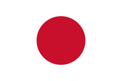
Japan
Where to begin. We honeymooned in Japan, a three week trip designed around visiting as many of Tadeo Ando’s buildings as possible. Turned out five was just about doable, but the search took us to Naoshima Art Island and it’s numerous commissions by international artists, Tawayara Ryokan in Kyoto, and of course the Park Hyatt in Tokyo months before the crew for Lost in Translation made it world famous.
Red 09
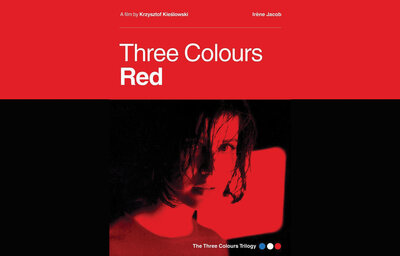
Three Colours: Red
Intelligent and thoughtful European filmmaking, Three Colours: Red is the final film of Kieślowski’s trilogy and is surely his most accomplished film. Starring Irène Jacob and Jean-Louis Trintignant, the film covers many themes — chance, betrayal, altruism — but is ultimately an exploration of fraternity across generations.
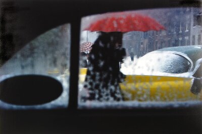
Red 10
Saul Leiter
The recurring red umbrella motif across his work is one of the many joys to be discovered in the photograph work of Saul Leiter. A very successsful commercial fashion photographer, he kept his street photography off the radar for decades. The most New Yorky shots of New york ever.